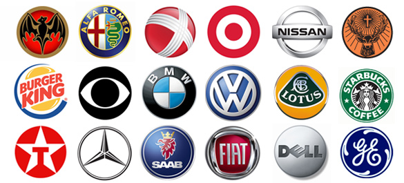
When going about the designing of a new brand logo, any brand design agency in London will tell you that two things matter more than anything else – impact and memorability. The long-term goal is of course for your brand’s logo to become a household name, but in the immediate moment, what’s more measurable and achievable is creating a logo of immediate and high-level impact.
Of course, with a million and one businesses all competing for the same public attention, it can be difficult to know where to start. Worse still, the desire to come up with something totally radical often leads some businesses down entirely the wrong path – they try to be so different that they end up with something that is irrelevant, unworkable and generally unpleasant in every way. Some would argue that there’s no such thing as a ‘right’ or ‘wrong’ logo for any business as it’s the brand behind it that counts, but at the same time there’s no denying the way in which some logos have way, way more impact and appeal than others.
So with this in mind, what follows is a quick guide to just some of the key rules for creating a brand logo that hits home for all the right reasons:
1 – Create Multiple Drafts
First and foremost, there’s probably never been any brand of any sort anywhere in the world that’s simply scribbled down one idea and gone with it. It just doesn’t happen this way, as even in the case of businesses with logos that come across as the simplest, you can bet your bottom dollar they went through dozens, maybe even hundreds of ideas first. Even if it means just sitting down with a piece of paper and letting your imagination do the work, it’s crucial to play around with preliminary ideas for as long as necessary in order to create a logo you’ll want to stick with long-term.
2 – Keep it Balanced
Subconscious as it may be, the vast majority of audiences naturally gravitate toward logos that are balanced by way of size, colour and graphics. It’s not a case of having to come up with something that is either square or symmetrical, but when you look at say 50 of the world’s most successful brand logos, you’ll note that almost every single one of them has a pretty equal balance of ‘weight’ on both sides.
3 – Consider Size
Some logos look great when scaled down to the size of a postage stamp while others look the part when blown up to billboard size – the idea here is choosing a logo that looks great in both instances. Think about how legible and recognisable your logo would be if you were to shrink it down to the tiniest size, or whether it’d become an eyesore at a much larger size.
4 – Care with Colours
Again, some would argue that there’s no ‘right’ or ‘wrong’ way of going about colour choices, but when you look at the leading brand logos the world instantly recognises, these colours were not chosen as random or by accident. You’ll note a distinct lack of anything too garish like neon pinks, sparkly electric blues and so on and so forth – you may also notice that most choose no more than two or three colours maximum. All this is of course for a very good reason – careful colour choice impacts the logo’s impact enormously.
5 – Limit Font Variations
It often ends up being the font that’s used in a brand’s logo that becomes as synonymous with the brand as the logo itself – Heinz, Coca-Cola, Sony, Disney etc. As such, it’s a good idea to not only be original when it comes to your choice of fonts, but to only ever use a maximum of two fonts and even then to proceed with care. If you can get away with just a single font that’s legible, attractive and represents your brand perfectly, stick with it.
6 – Keep it Simple
Last but not least, it’s the rule that comes up time and time again across so many areas of the subject – simplicity sells in a very big way. Again, take another look at the kinds of logos you’re aspiring to replicate the success of and you’ll immediately notice that very few of them come close to being complicated. Google for example uses a few coloured letters in a simple font, as does eBay. Sony doesn’t even need to vary its colour from black to be massively recognisable, as is the case with Nokia. The simpler you can be with your logo, the better its chance of hitting home long term.

