You and Your Logo
Your logo communicates your business’ identity. Forget trying to explain who you are, with a simple and powerful image, you can say it all. A good logo requires careful consideration and a bit of research. To get your foot in the door on this project, take a look at the questions posed by this expert: Understanding What Your Logo Says About Your Brand. In order to figure out what to do with your logo, you’ll want to take a look at what some of the most successful companies have done with their logos.
Learning from the Best
Think about the McDonalds logo. Those two yellow arches are recognized around the world. Now consider the Starbucks logo. What’s common to both McDonalds and Starbucks? Each of these logos makes use of one basic color. Did you know that 95% of all businesses stick to one or two colors in their logos? Blue is the most popular color choice with both red and grey being the next most popular.
What does this mean for your business? Well, clearly color plays a big part in your business logo. But how do you choose which color to use?
Your Color Choices
Different colors communicate different ideas. It is important to note that the meaning of these colors may vary with culture. Consider who your target audience is. The following are some of the common color meanings for America.
- Blue – Strength and Dependability
- Psychological studies have also shown that blue has a calming effect on the audience.
- Red – Action and Energy
- Yellow – Positivity and Motivation
- Green – Nature and Serenity
- Purple – Creativity and Royalty
- In ancient times the dye needed to make things purple was very expensive, so only those with significant disposable income could afford it, hence the connection to royalty.
- Orange – Energy and Confidence
- Pink – Femininity and High Energy
- Brown – Dependability and Simplicity
If your target audience is different than the typical American audience, or your business does a lot of international work, you may want to check out this source: Empower Yourself With Color. Spending some time to consider the meaning of your color selection is a worthy investment in your logo design.
Say What?
Besides color, logos vary between being picture oriented, such as McDonald’s arches, to being text dominated, such as the Disney Company’s logo. Some logos include both elements. For example, Starbucks has the mermaid image, as well as the text “Starbucks.” At different points in the history of Starbucks the words and image have been emphasized differently. Today the company sticks to the word logo in certain circumstances, while a significant amount of their merchandise, including their cups, feature the image alone.
Should you choose to make use of a word-based logo, you will need to select a font to use. Similar to color, different fonts say different things to the audience. With a total of 41% of companies making use of only text in their logo, your font can become an essential part of your logo’s ability to present your business to the world.
The Importance of Font
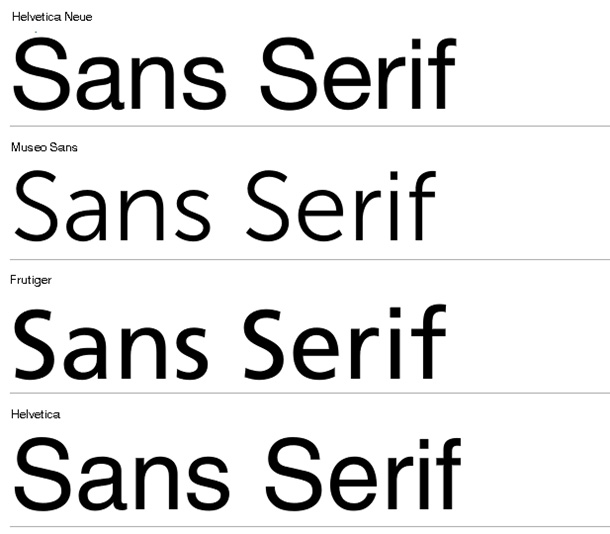
You can divide the majority of font styles into five categories: Serif, Sans Serif, Slab Serif, Script, and Modern. Here are the definitions of these styles and their characteristics.
Serif
This type of font includes accents at the end of each letter. Some examples include: Times New Roman, Georgia, and Book Antiqua. These styles connote dependability, trustworthiness, and conventionality.
 Sans Serif
In this style, there are no accents at the end of each letter. For example, Hero, Arial, and Gotham all fall into the sans serif category. These fonts evoke feelings of freshness, contemporariness, and a sense of being unbiased.
Slab Serif
These fonts have solid and rectangular accents. Freshman, Rockwell, and Museo all count as slab serif. Fonts in this category convey boldness, sturdiness, and hipness.
Script
These fonts are designed to look like authentic handwriting or calligraphy. Fonts such as Pacifico and Mission Script fall into this category. Script fonts connote gracefulness, welcoming, and artistry.
Modern
Characterized by being geometric and sharp, examples of the modern category include Architext and Majoram. These suggest intelligence, crispness, and chicness.
You can learn more about these categories and their meaning here: http://www.entrepreneur.com/article/227766#
Using your Logo
Once you’ve got your logo designed, its time to use it! One of the best ways to get your logo out into the world is with a sign. What better way to get people to start associating your business with your logo than having them see it every time they drive by your office?
Featured images:
License: Creative Commons
image source
License: Creative Commons image source
Louise Williams is a writer working out of Virginia. She has personally designed her own business logo, and loves the art of font.
- Android Security: NordVPN Is Best For CyberSecurity For Android - April 9, 2021
- What’s Wrong With My Mac? How to Test Mac Performance (And Improve It!) - September 7, 2020
- Before You Subscribe: 5 Things You Need to Know About Hulu’s Live Streaming Services - September 7, 2020
Leave a Reply